In the early stages of negotiations between Reebok and the UFC I was tasked with developing an initial graphic direction for potential fight uniforms, that would later go on to inspire the final designs that were recently released by the brand.
My first inclination was to look to look at the simple but unique graphic style of the old Pride Fighting Championship posters. The shapes that were used were always really simple, but their applications were bold and the posters were mostly typography-driven.
Quick concept sketch for how the graphics could lay over a body.
Branding was imperative. The goal was the make it clear that these were UFC uniforms and to highlight the fighters name. The graphics were to be clear and iconic, and to mature past the patchwork look of having multiple sponsors represented on the apparel that distracted from the UFC brand.
Graphic layout options for the compression top and board shorts:
Mock-up of fighter Johny Hendricks in a compression top and fight shorts with the potential graphic direction:
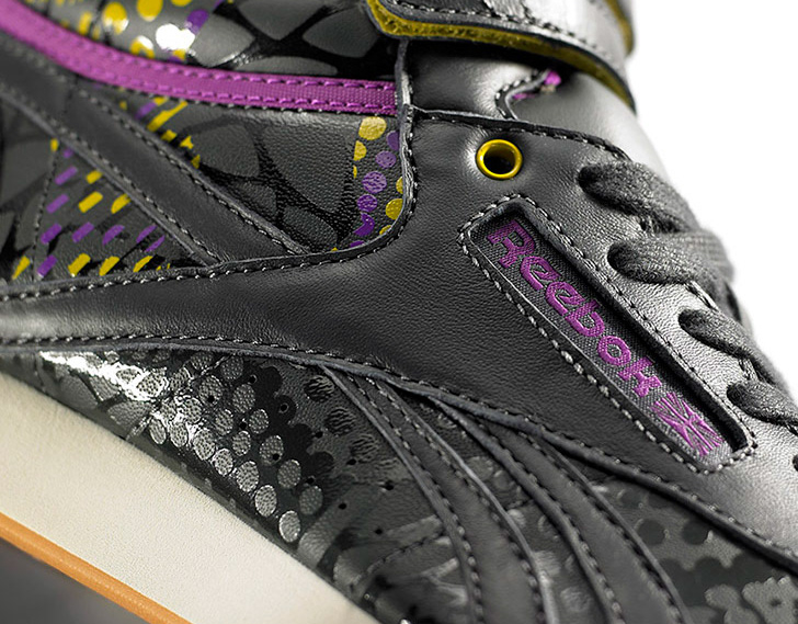
The final graphic application based on my inital graphic direction. This was project was finished after I already left the company, so I did not oversee the final apparel graphics below:


