NICKELODEON'S TEENAGE MUTANT NINJA TURTLES STYLE GUIDE
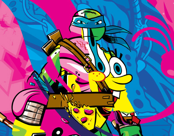
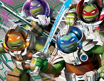
This is the core TMNT style guide for all consumer products going forward for 2015. All CG character art is supplied by the animation studio. All other illustrations, graphics and patterns were created by me. All artwork is © Nickelodeon 2015.
INTRO: With the new Core Teenage Mutant Ninja Turtles Style Guide, you’re in for some very noticeable changes. The refreshed character art is more stylized and colorful, and the unnatural lighting and dense blacks of our launch guide have been replaced with saturated primaries and stark whites.
Group compositions show off each brother’s individual personality within the team dynamic, while compositions featuring a single Turtle celebrate the elements that make him unique.
An emphasis on action and depth gives all compositions a dramatic and explosive quality. Also, the show’s action and humor are now more synchronized through the use of “emoticons” that convey what the characters are feeling and thinking in funny and unique ways.
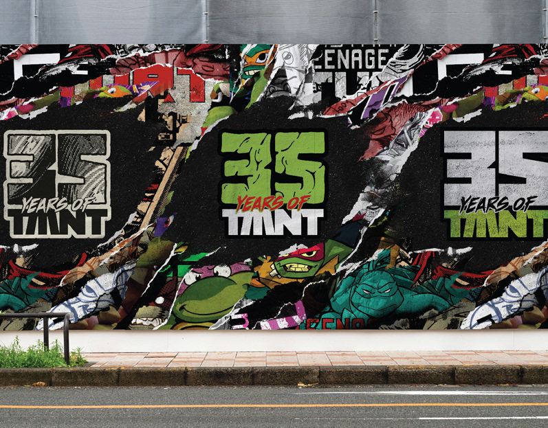
Finally, typography retains its roots in street art and comic books, characterized by hand-drawn elements contrasted with clean, dimensional, blocky letters.
BACKGROUNDS
PATTERNS


